This statement is the heart of the identity. We find it through thorough research into the business and the category, and use it to build the whole brand around it.
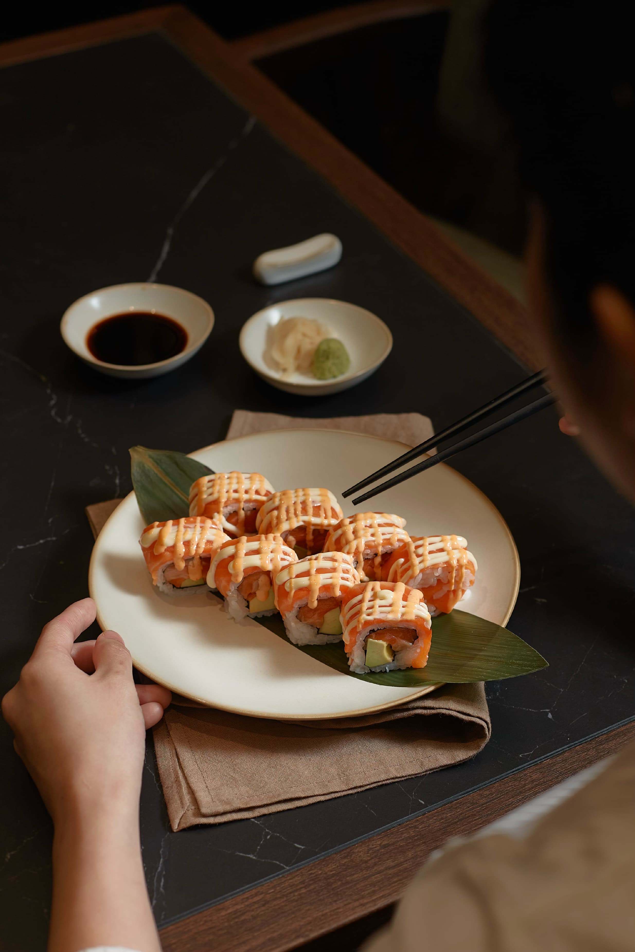
Hokkaido Table is an Italian-Japanese fine dining restaurant where the freshness and quality of Hokkaido's ingredients take centre stage.
The identity is sober, elegant and understated. Rather than relying on decorative or elaborate branding, it lets the ingredients and the quality of the dining experience speak for themselves.
Four simple ideas shaped the identity. They set the ground for the visual language, the choice of materials and the overall experience, keeping the brand focused on what matters most: the ingredients.

This moodboard shows where the identity comes from. Macro shots of fresh produce, such as cabbage
and mushroom, capture the natural colours and textures of the ingredients, while Italian cooking, a server
in a burgundy apron among greenery and restrained typographic brand references set the tone. From
these images we sampled a subdued, refined palette: Tangerine Orange and Beetroot Red, Pesto and Pistacchio Green, and Sandstone Beige, balanced by soft neutrals such as Limestone Grey and Marble White. The result is a sober, elegant and understated identity that lets the produce and the dining experience come first.
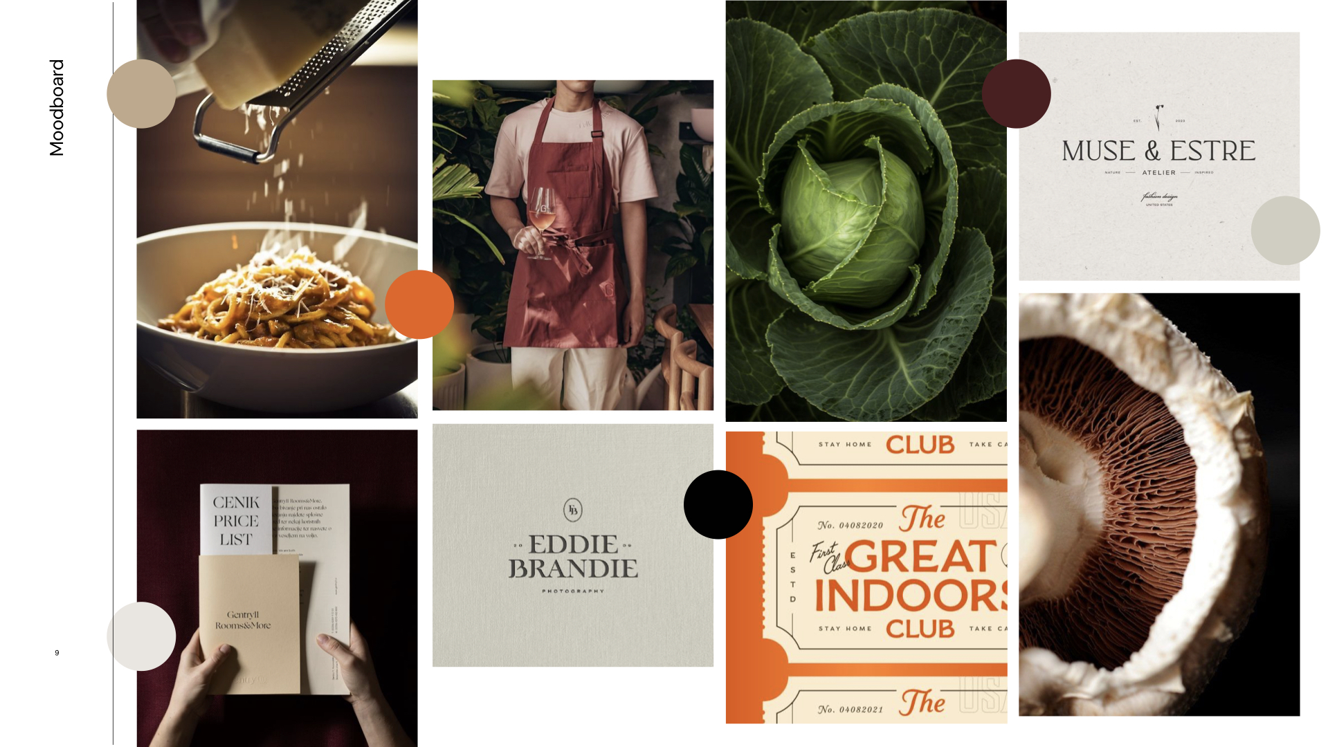
The colour dots on the board mark the shades sampled from the images,
translated into a subdued and refined palette.
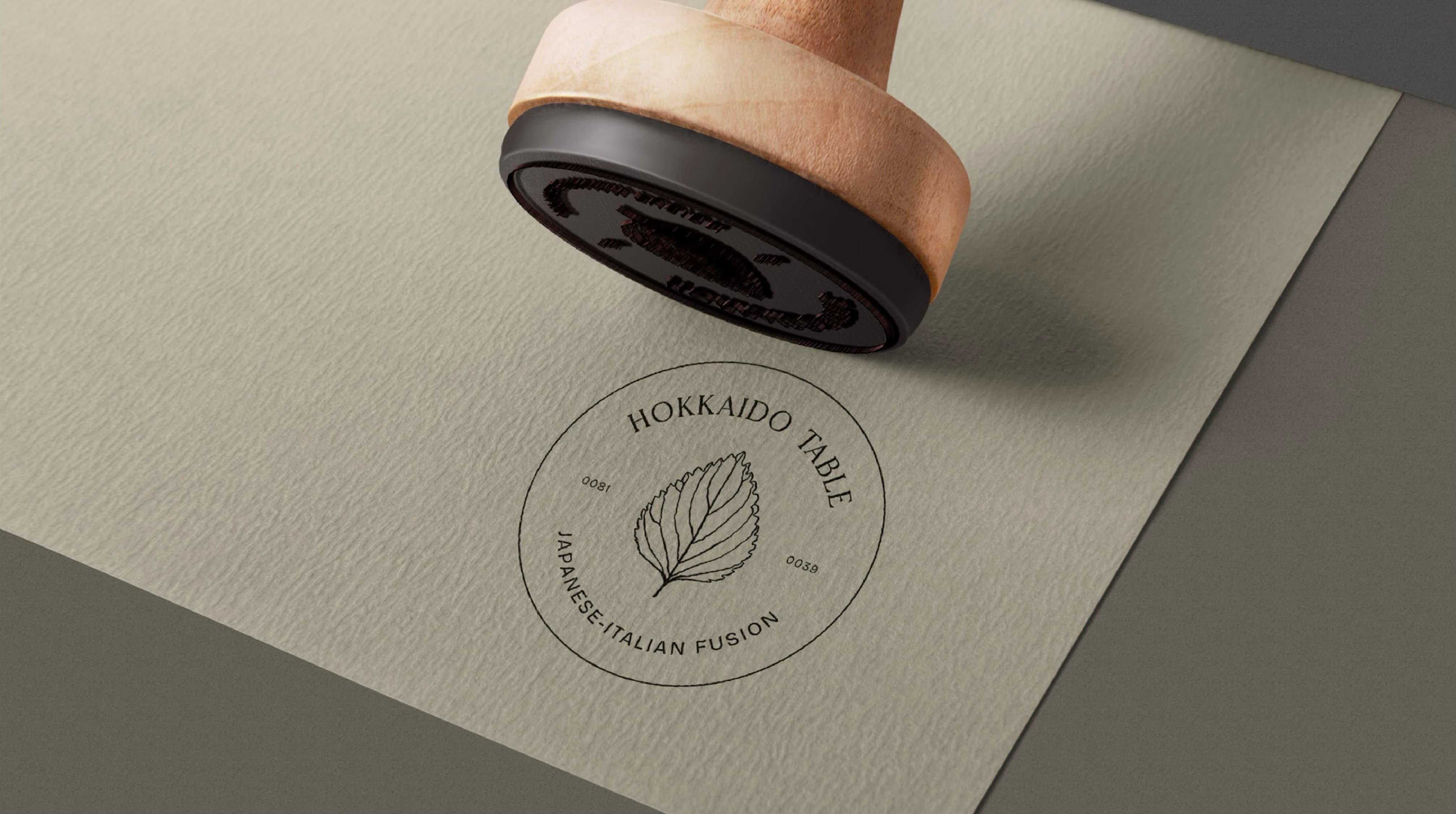
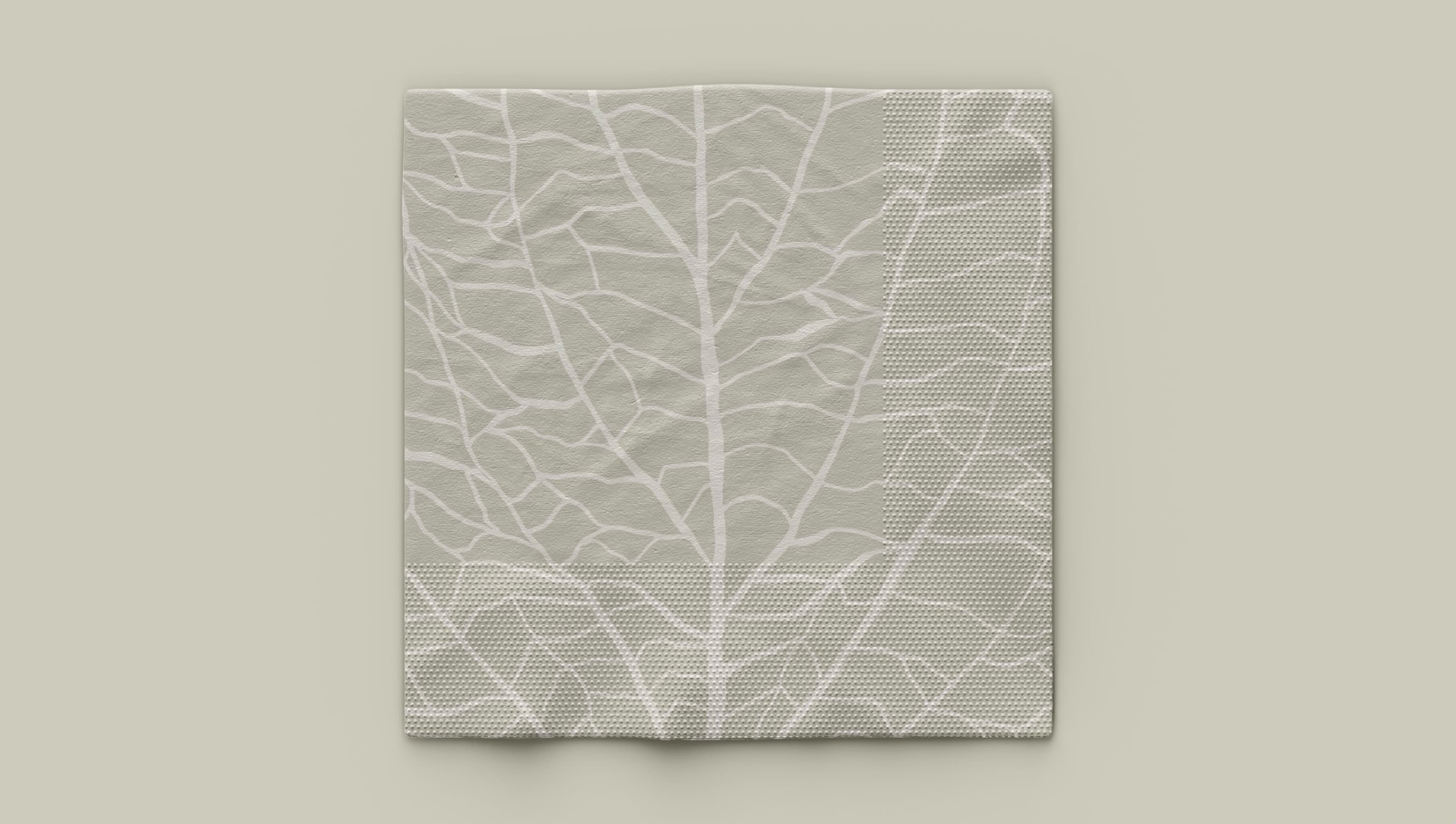
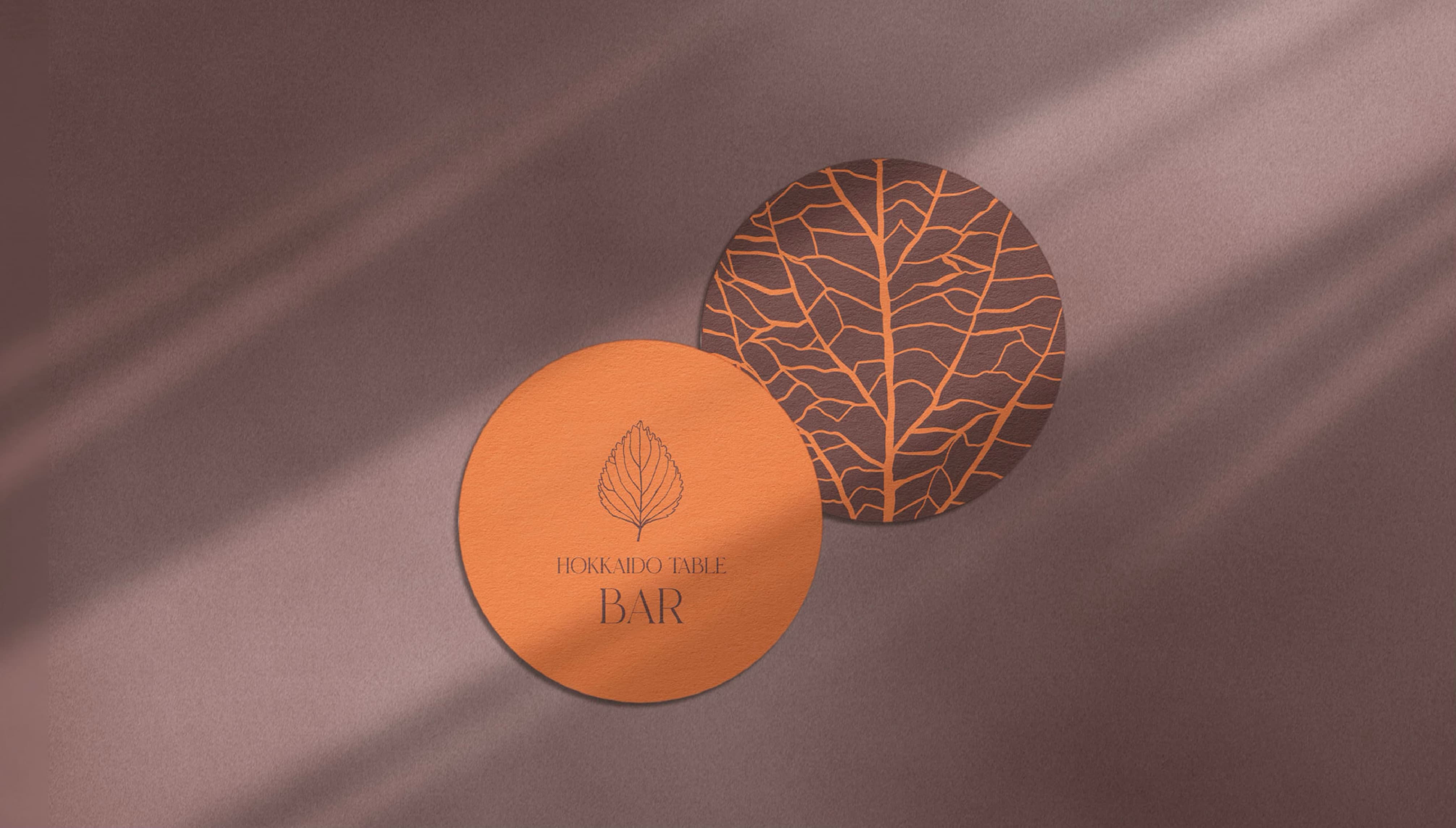
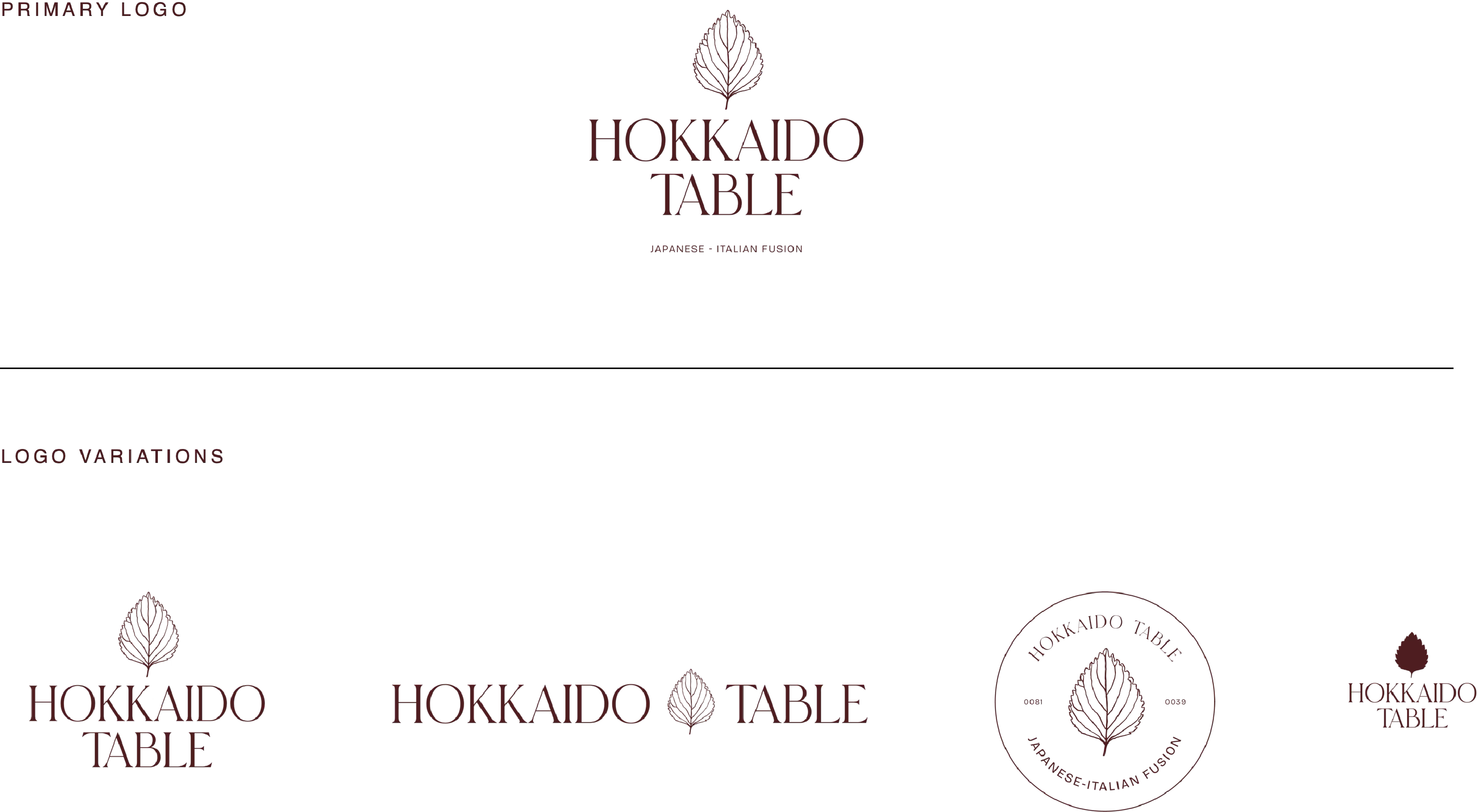
The logotype pairs an elegant serif wordmark with a fine line drawing of a shiso leaf, a quiet nod to the freshness at the heart of the concept. The mark comes in several forms, shown below: a stacked primary logo, a horizontal lockup, a circular stamp and a compact version for small formats. The same leaf and wordmark also extend to a dedicated Omakase lockup, and the leaf's delicate veins become a pattern used across coasters, napkins and packaging.
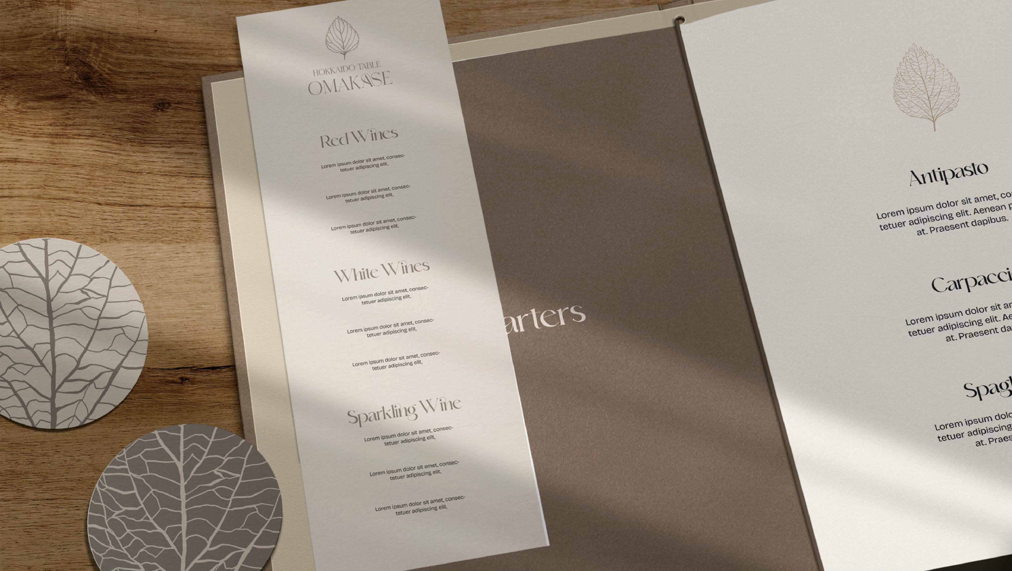
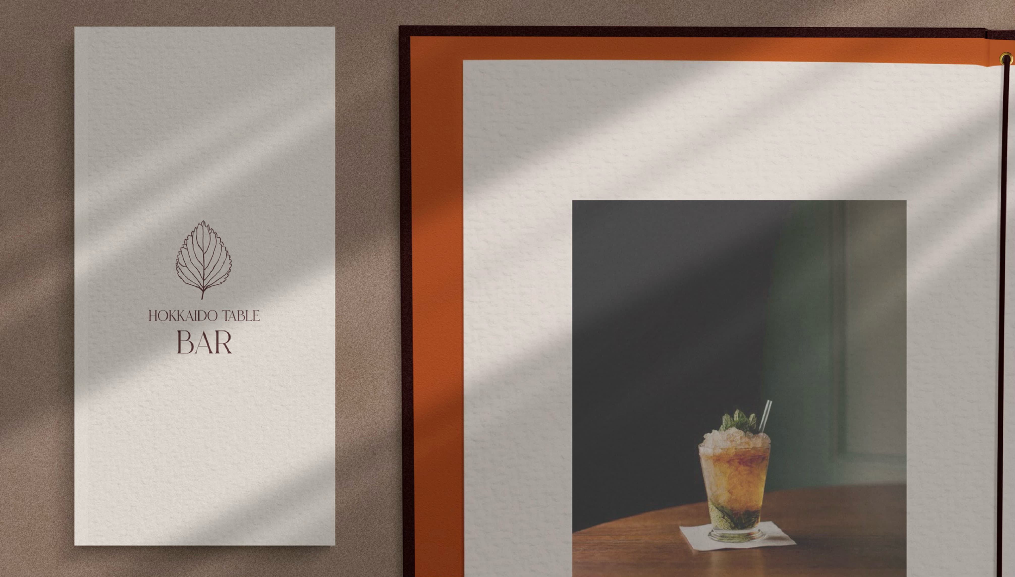
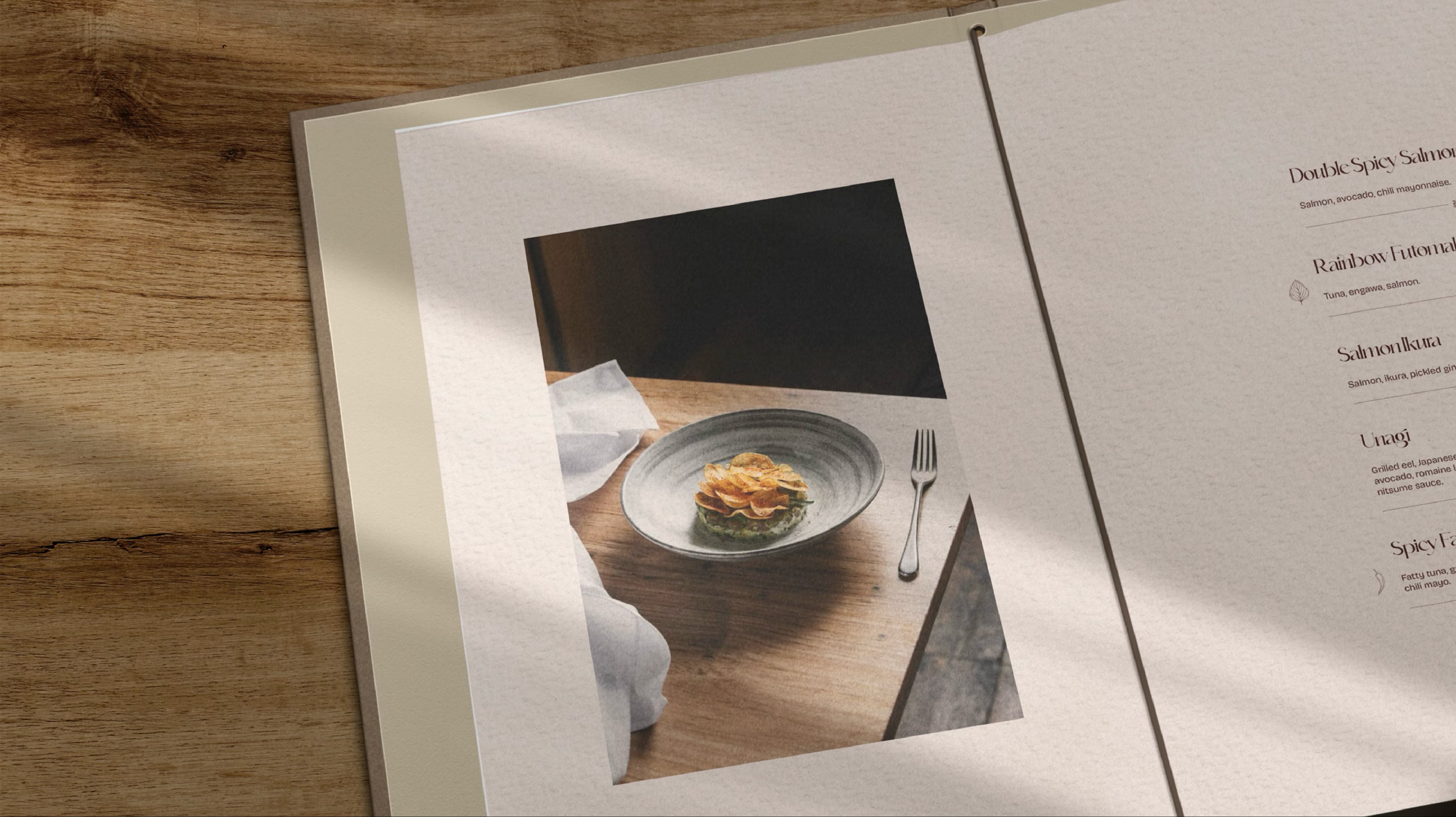
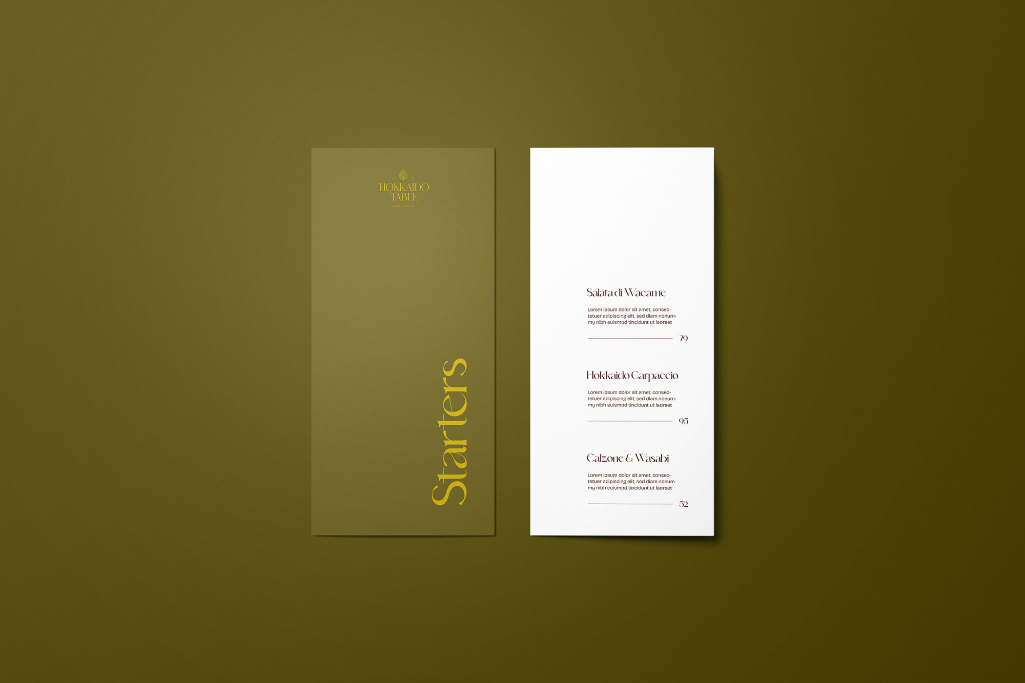
The menu is set in the identity's typography on raw, natural paper, with the shiso leaf as a quiet accent. A calm, uncluttered layout lets the dishes and their ingredients lead. The system extends to a dedicated bar menu and coasters, which add the Bar's tangerine accent.
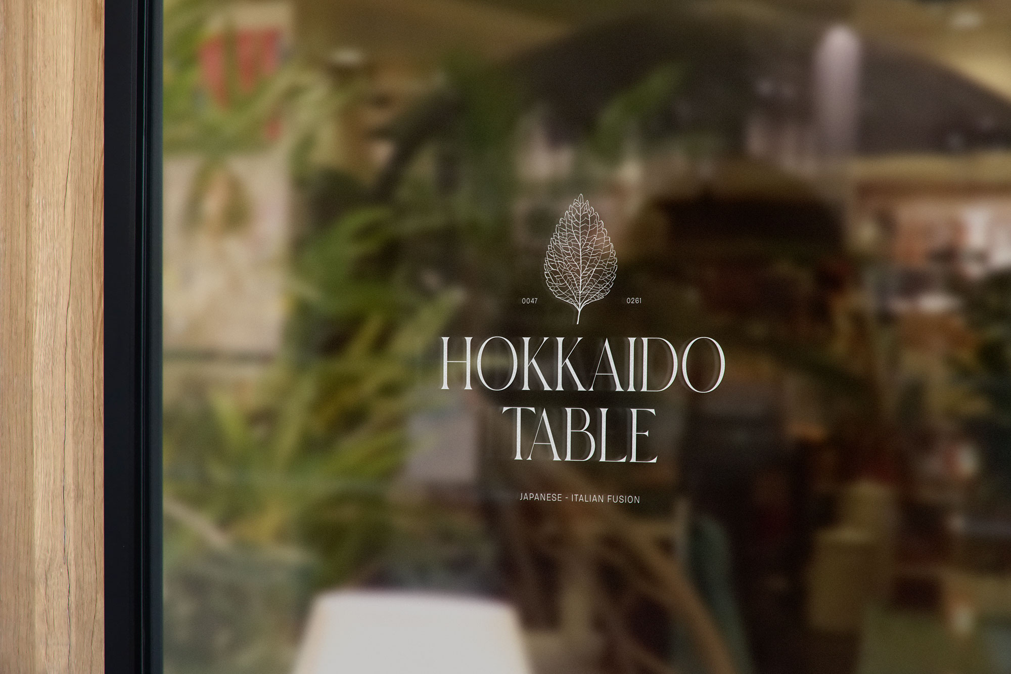
The identity comes to life on the restaurant's glass frontage. The logo is applied in a fine white line, so the greenery and warm light inside show through.
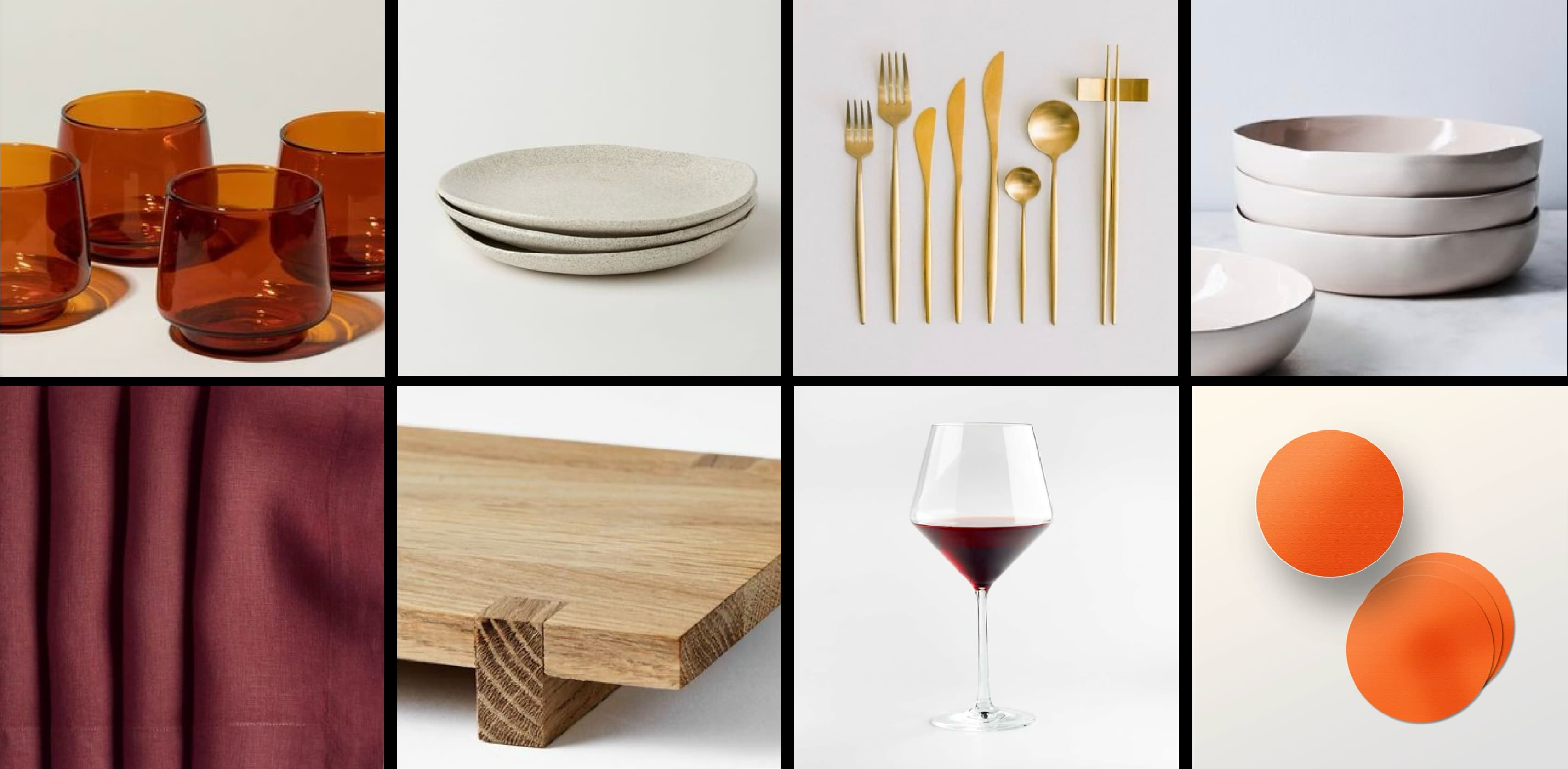
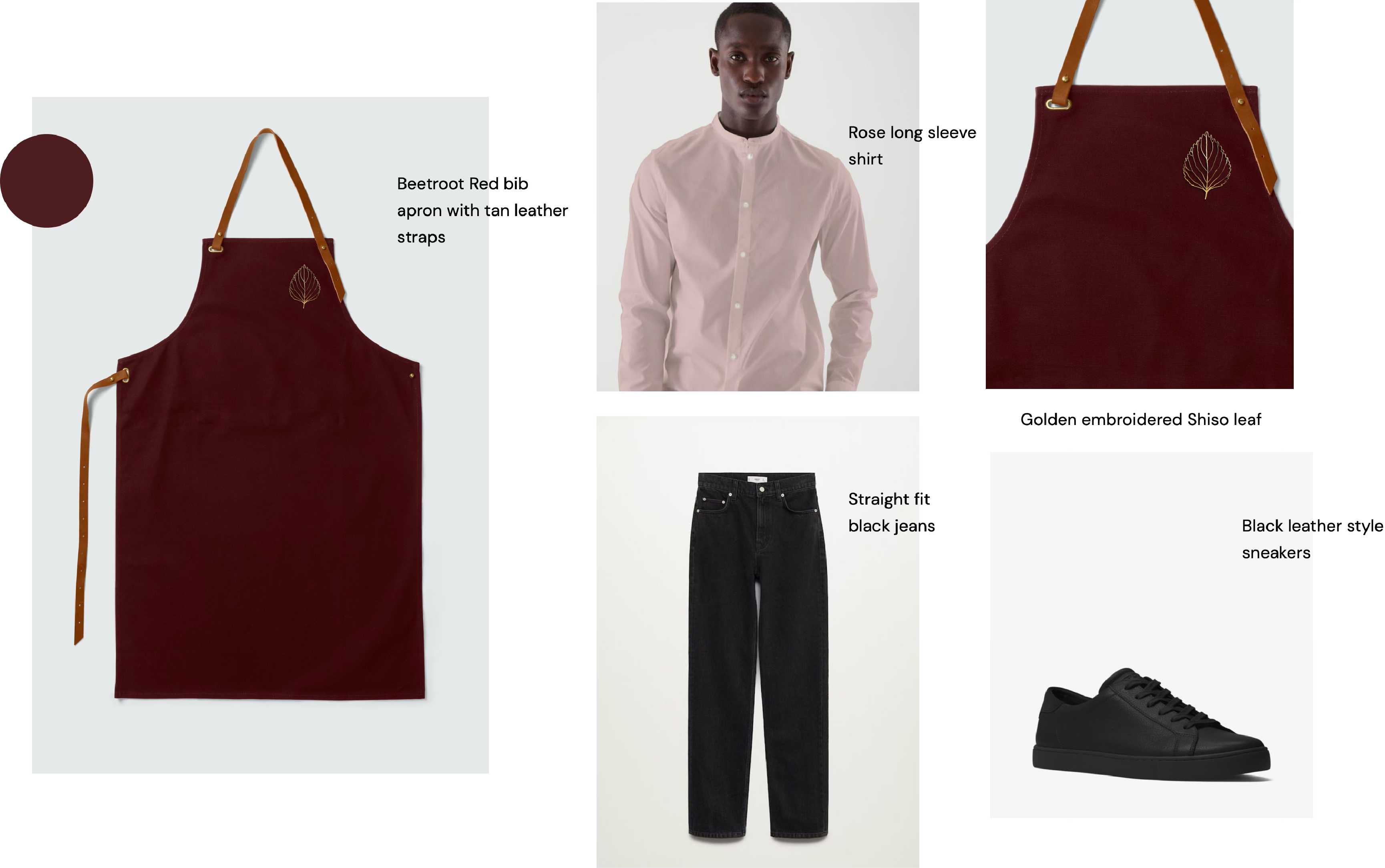
We recommended raw, natural materials for the textiles, menu paper, cutlery and dishware, reinforcing the concept while keeping the focus on the quality of the ingredients. This approach extends to the uniforms, with simple silhouettes and natural fabrics creating an understated elegance, while the bar introduces Beetroot Red and Tangerine Orange for a more playful touch of Italian charm. Tan leather straps and a golden embroidered shiso leaf complete the look, tying each detail back to the identity.
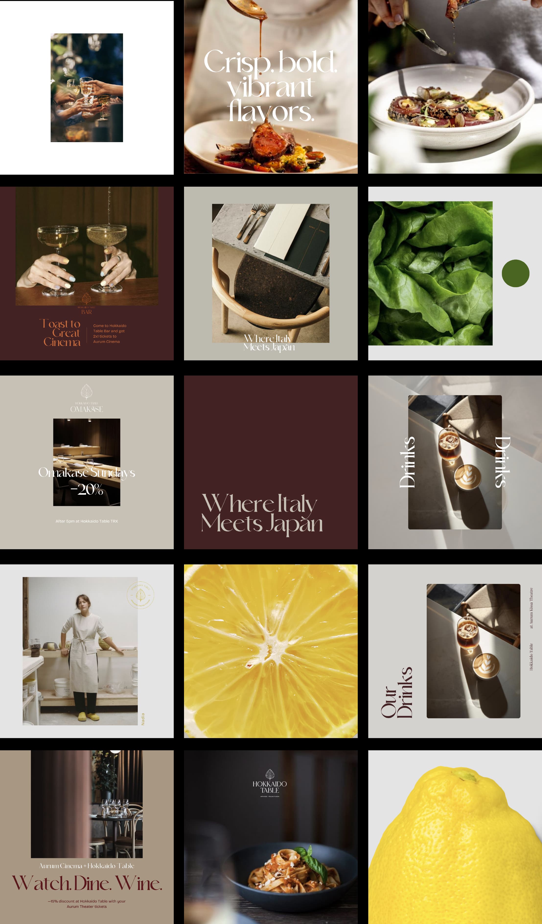
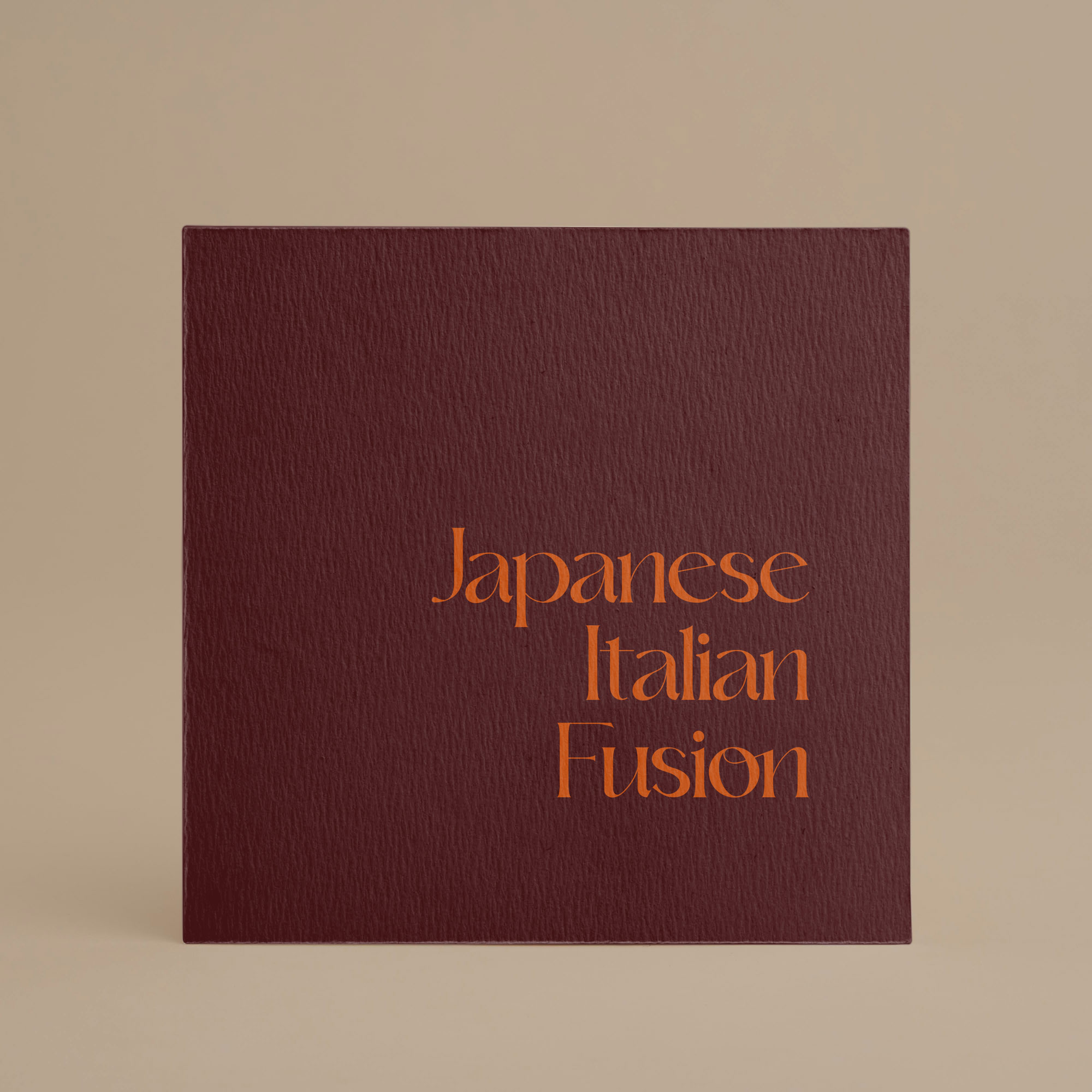
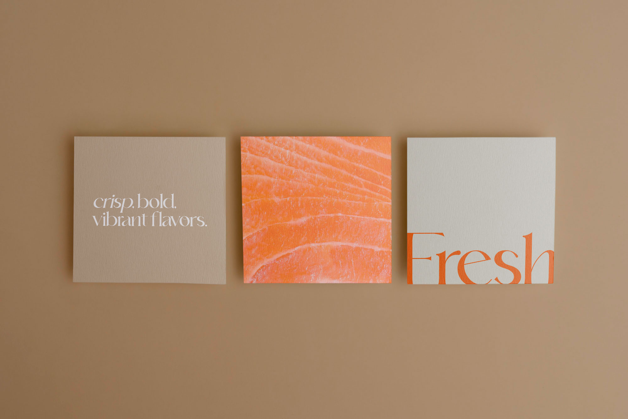
The visual language also extends to social media content. The Instagram grid alternates close-ups of the ingredients and food photography with simple typographic cards, using short lines such as “Crisp, bold, vibrant flavors.” and “Japanese Italian Fusion”, all in the brand palette so the feed feels as calm and refined as the restaurant.
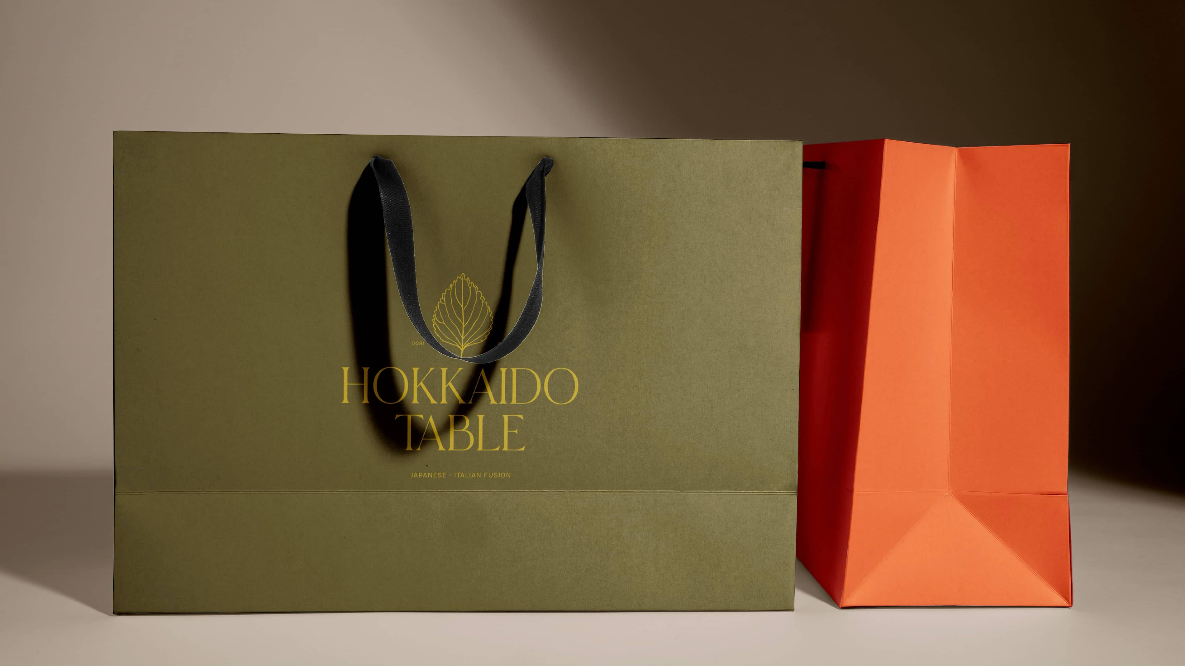
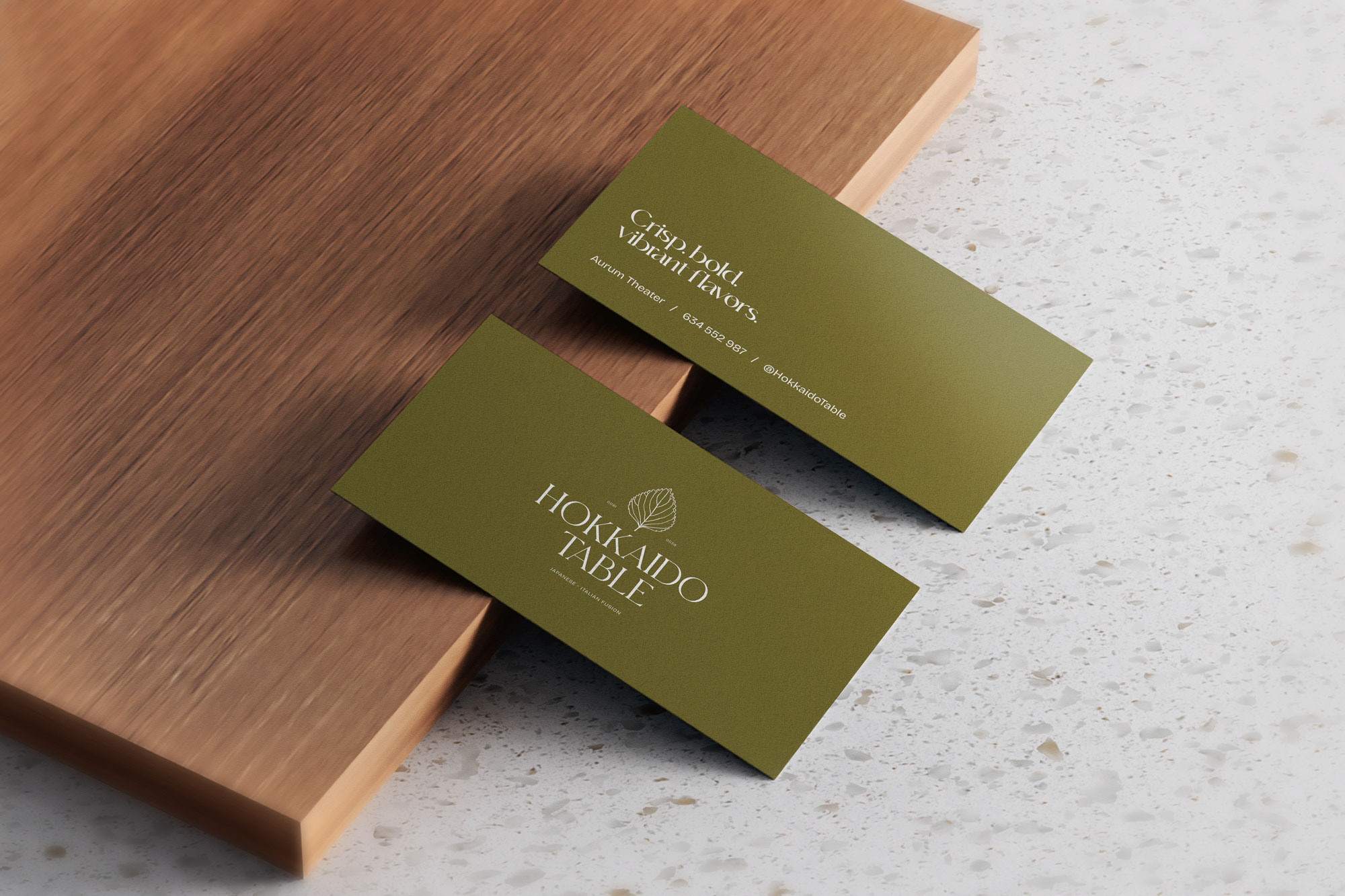
The identity travels beyond the table. Shopping bags, stationery and small finishing details carry the logo and the leaf pattern in the same restrained palette.